Check out this guy's work. Very Chicago, very beautiful, needs a monograph. www.timothylevaughn.com or www.levaughn.com
Very high end for the most part so the level of detail is exceptional across a beautiful range of very "Chicago" project types. I used to work quite a bit with Tim, we share a lot of the same DNA as designers and renderers but still go in different directions. And Tim, in terms of beautifully built projects, is way more prolific. Enjoy...
Thursday, December 26, 2013
Thursday, December 19, 2013
A little chicken coop...


My friend is all over this. About the only thing we can't agree on is whether we should stain all this wood or just paint everything white. It's a farm, so all white is going to get dirty fast. But I think staining the wood is going to bleach out fast and give it a sharecropper look. So, who knows? Maybe somewhere in between...

Wednesday, December 18, 2013
Right now, it's all about a sketchbook...

As far as the sketch book as monograph thing goes? Hmmm.....well, for me, the absolute Holy Grail of architectural monographs has always been the Wasmuth Portfolios that Frank Lloyd Wright and Ernst Wasmuth published in 1910 / 1911. Note that I mentioned that Wright published the portfolios because he actually did very few of the drawings. Many of the best drawings were done by Marion Mahony Griffin, a draftswoman of extraordinary skill and virtuosity. If you don't know who she is, Google her. I would love to have seen some of her sketchbooks while she was working on the Wasmuth folios. Under Wright's obvious influence and a tutelage probably neither enjoyed or would have admitted to, her drawings "set the narrative tone" for the portfolio itself with the marvelous graphic consistency that all of the drawings share. Part of this is merely the technical means of the drawing.....ink on linen, black and white offset printing, and so forth. But an equal part of it is also in the drawing hand, i.e.; "who drew it".....ink washes, entourage, drawing composition, line work and on and on. It was Mahony's ability to manipulate all of factors simultaneously that, even today, give the Wasmuth Portfolio monographs their beautiful and consistent narrative quality.

Oh, and by the way, these are sketchbook design studies of a residence in New Hampshire. They are done in a multi-media watercolor paper sketchbook in ink and rendered in 2H and 3H pencil. And drawn at the very sketchbook friendly scale of 3/16" equals one foot.
Friday, December 13, 2013
A Captive Audience...Sketchbook, Part Three
Some more sketchbook bumf...the captive audience aspect of hospitals and doctors having been previous alluded to, these are a series of sketchbook design studies for one of my doctors. She wanted to rework the entrance to her weirdly modern house in Marblehead, Massachusetts. So, voila', instant solution. Well, not so instant but fun to do. Drawn in the same media as described in the previous post, this is all about pen, pencil and watercolor paper. This project was constructed in about three weeks and turned out really well, thanks to an exceptionally talented contractor. It looks really cool at night when the Kal-Wall canopy is illuminated and the decorative lighting is turned on. I'll post some pictures when I get the chance but trust me, it turned out just like the drawings. I love it when that happens...


All of these drawings are done in a multi-media watercolor paper sketchbook. They were drawn from photographs as hardline studies in 3H pencil and then inked freehand with Micron and Pilot Razor Point pens. The pencil washes were slowly built up with 2H and 3H pencils. The landscape entourage is pretty accurate. And that guy on the right is me. The woman sitting on the bench in the drawing in the middle is the client. Well, mostly...

Design Study.....Sketchbook, Part Two
These are a series of sketchbook design studies for a vacation cottage on Cape Cod in Truro, Massachusetts. I developed these this summer while I was in the hospital and had a lot of time to kill designing houses for all the doctors. These elevations were drawn at 1/4" scale in a cold press water color paper sketchbook. The drawings are constructed as hardline studies in 3H pencil and are then drawn freehand with Micron, Pilot Razor Point and Sharpie ink pens. They are rendered with H and 2H pencil washes. The scanner I used washed out a lot of subtleties and contrast in the pencil washes and shading which is kind of a bummer but there are ways around this if you have more patience with your scanner. Which obviously I don't...


Friday, November 15, 2013
It's been awhile.....Sketchbook, Part One
It's been a very long time since I've posted anything. Like 8+ months, so it's certainly been quite a while. There haven't been any howls of protest for the dearth of recent posts, so at least I don't have to feel bad since I'm pretty sure that the audience for this blog is pretty small. And besides, I have a fairly rational excuse for not posting much. I've spent most of 2013 in various hospitals, culminating (for the time being, I hope) with having a below the knee amputation of my right leg. My point here is that this kind of changes your perspective on things and forces you to relearn how to do a lot of things you used to take for granted. Things like walking. Or sitting at a drawing board. Or, for that matter, drawing by hand with a sketchbook in your lap. You wouldn't think this would matter much but it's kind of hard to balance a sketchbook on one leg when you're in a hospital bed. But, as they say, there are ways around that...
For a long period of time I was sort of left alone in my hospital room with a very timely gift from a friend, namely a watercolor paper sketchbook, a few 2H/3H pencils and a few Micron ink pens. With nothing better to do, it was time to drag out those stone age drawing skills. No drawing board, parallel bar or T-square and once you started the ink work, erasing was definitely not an option. All of which means you draw slowly. Very slowly. I am showing the first sketchbook project here and will show a couple of the other ones I did in the same environment in some future posts.
This is a series of hypothetical plan and elevation studies for a small artist's studio. The building is very diminutive, having a 16' x 21' footprint with a fine fissured stucco exterior. The purpose here I guess was to reacquaint myself with a design vocabulary I had not used for awhile. The materials I would suggest are slate roofing, copper roof flashing, bronze frame skylights, red cedar roof / interior framing and mahogany doors, windows and exterior trim and brackets. Basically, very fine materials in a very small package. The single interior space would be open to the skylights and dormers above. All things are possible in sketchbook utopia when you are the client.....


All of the images for this little studio were lightly constructed as hardline drawings with 3H and 4H wood pencils and then inked in freehand with Micron 02 and .005 pens. The final stages were, given the luxury of immobility induced time and patience, some very self indulgent pencil washes with HB and H pencils which, unfortunately, the scanner seriously washed out. All of the elevations were done at 3/8" scale and the composite plan drawing at 1/4" and 1/16" scale. All these drawings were all done in a multi-media water color paper (140 lb. cold press) sketchbook which just loves pencil washes done with a very light hand with a lot of time to spend. The subtleties and softness of the drawings are best seen if you click on the images to view them at a larger size. Or photograph the drawings rather thn scanning them. See the post about sketchbooks where I bitch about this a little further...

For a long period of time I was sort of left alone in my hospital room with a very timely gift from a friend, namely a watercolor paper sketchbook, a few 2H/3H pencils and a few Micron ink pens. With nothing better to do, it was time to drag out those stone age drawing skills. No drawing board, parallel bar or T-square and once you started the ink work, erasing was definitely not an option. All of which means you draw slowly. Very slowly. I am showing the first sketchbook project here and will show a couple of the other ones I did in the same environment in some future posts.
This is a series of hypothetical plan and elevation studies for a small artist's studio. The building is very diminutive, having a 16' x 21' footprint with a fine fissured stucco exterior. The purpose here I guess was to reacquaint myself with a design vocabulary I had not used for awhile. The materials I would suggest are slate roofing, copper roof flashing, bronze frame skylights, red cedar roof / interior framing and mahogany doors, windows and exterior trim and brackets. Basically, very fine materials in a very small package. The single interior space would be open to the skylights and dormers above. All things are possible in sketchbook utopia when you are the client.....
All of the images for this little studio were lightly constructed as hardline drawings with 3H and 4H wood pencils and then inked in freehand with Micron 02 and .005 pens. The final stages were, given the luxury of immobility induced time and patience, some very self indulgent pencil washes with HB and H pencils which, unfortunately, the scanner seriously washed out. All of the elevations were done at 3/8" scale and the composite plan drawing at 1/4" and 1/16" scale. All these drawings were all done in a multi-media water color paper (140 lb. cold press) sketchbook which just loves pencil washes done with a very light hand with a lot of time to spend. The subtleties and softness of the drawings are best seen if you click on the images to view them at a larger size. Or photograph the drawings rather thn scanning them. See the post about sketchbooks where I bitch about this a little further...
Wednesday, January 23, 2013
Small Cottages...
Paraline drawings, often referred to as "axonometric" or "isometric" drawings, are a method of abstract, plan projection three-dimensional drawing that sees less currency of use in the digitally drafted environment in most of today's architectural offices. Often referred to as a "poor man's perspective" due to their simplicity and ease of construction, it is increasingly rare now to see them at all outside of their occasional use in a classroom or studio setting. There are a variety of reasons for this, in particular the immediacy that digital drafting brings to quickly developing wire frame and photo-realistic 3D images of a project. I once worked with an architect who especially detested paraline drawings, his argument being that it was an underhanded, misleading means of three dimensional representation when you could spend the same amount of time developing "eye level" perspective drawings. But then again, he also hated rendered elevations, building sections and floor plans, especially if he was the one who had to draw them.
There was certainly an element of truth in his bias as foresight. I find paraline drawings to still be extremely useful and informative drawings, especially early in the conceptual design phase of certain types of projects. The most obvious "ease of use" feature is being able to work at a specific and constant drawing scale. Another is the "bird's eye" quality the drawings have, making them especially useful in providing an overview of a project that has multiple buildings or is a single building to be developed in phases. In essence, I have to try to think of the drawing as an abstract two-dimensional rendered site plan. I learned early on that paraline drawings should never replace what you learn about a project through true perspective drawing. But there is always an element of abstraction in any type of architectural hand drawing, be it in the form of strategically placed and rendered entourage, material representation, time of day or so forth. Paraline drawings embrace this concept as well by means of constant use of scale and the lack of convergence to vanishing points common in true three dimensional perspectives.
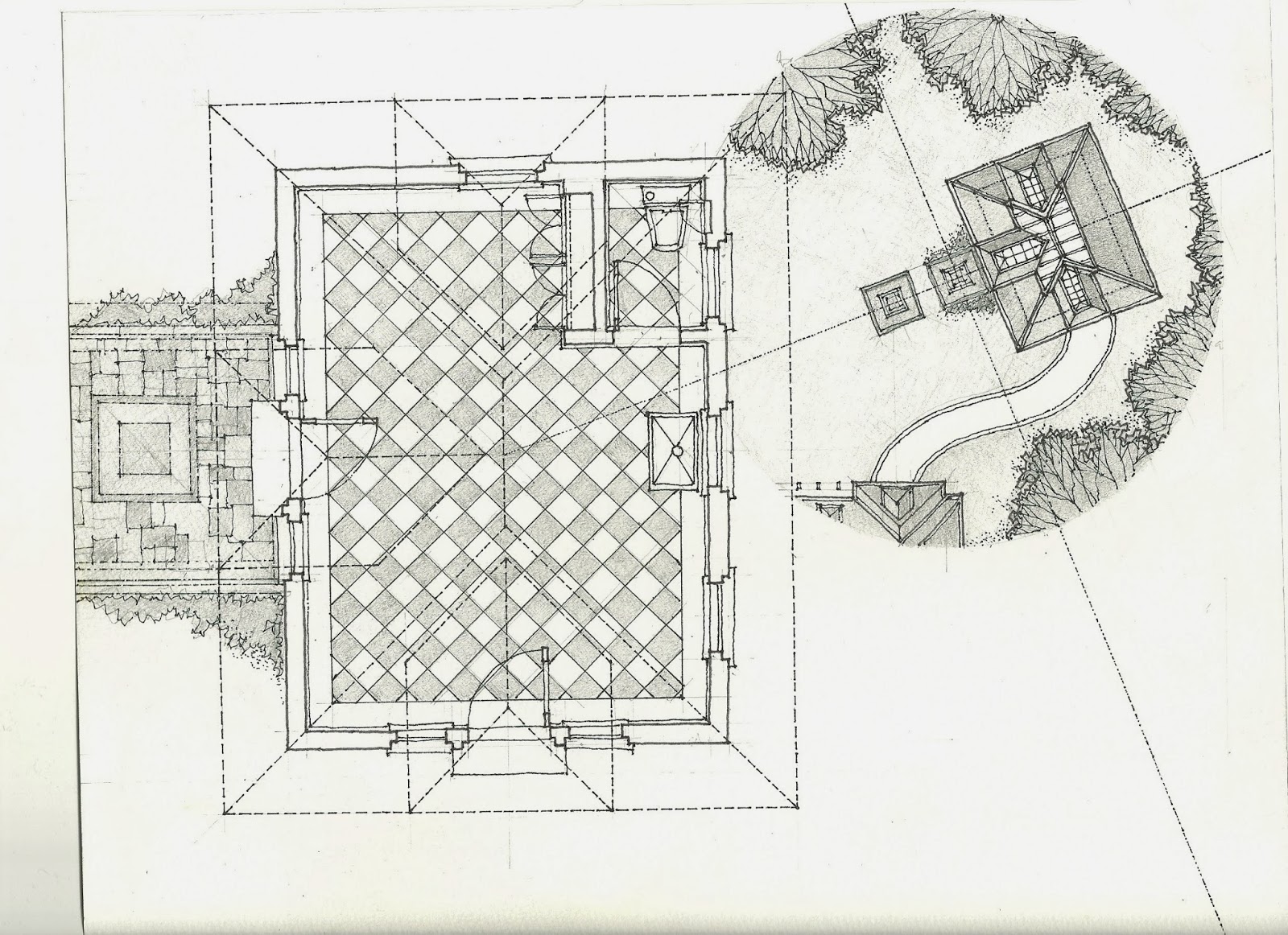
 In the drawings shown here, the purpose of the exercise is to provide an overview of a particular project that has an important interrelationship between two buildings and their obvious siting characteristics on a small piece of waterfront property. Big pond or small lake, tomatoe or tomato. It was drawn during the schematic phase and used in lieu of a site plan that was purely a plan drawing. It is a conceptual design study for a pair of small, seasonal, lake front vacation cottages on a shared lakefront site and was drawn at 3/16" scale while the project was in its earliest stage of design. Given that I already had a high degree of familiarity with the both the compositional and material qualities of the design and the unique "micro" qualities of the site, I was able to develop and present this scale drawing in the schematic design phase as opposed to more conventionally drawn and rendered building elevations. Later drawings did present these elevations (and eye level perspectives) but as an overview of the project, this remained the most effective and frequently used presentation image.
The landscape entourage in the drawing foreground was used to emphasize a unique feature of the site, specifically the extreme grading that allowed you to climb up at the edge of the site and look down on the shared front lawn, assuming you didn't mind briars and thistles cutting your legs. While not defined by an actual, physical pathway, it provided an immediately recognizable reference point that offset some of the "paraline" qualities of the drawing. The initial drawing was conceptually developed in sketchbook form (see above) and then revised when the final site was selected.
 |
Enlarged Axonometric View of Cottage One - 2012
See Image below for material and media.
|
 |
Enlarged Axonometric View of Cottage Two - 2012
See Image below for material and media.
|
 |
Axonometric View of Front Lawn - Proposed Vacation Cottages - Brown County, Indiana - Preliminary Design Study, 2012
3H pencil, Micron ink pens, Prismacolor colored pencils, Chartpak AD Markers on white tracing paper. Original Image is 22" x 11", constructed at 3/16" equals 1'-0"
|
Sunday, January 20, 2013
Small Farm, Small Barn...
These are a series of design drawings done over the last couple of years for a barn project in northwest Mississippi. It's for a client built, multi-purpose barn to be built in phases that has gone through a rather gradual evolution in size and program. The site is a three acre organic farm that has milking cows, egg producing chickens and a limited number of free-range pigs as its primary livestock. The visual characteristics of the site are of a natural, non-cultivated landscape with north to south gradual down slope and a 1 acre wide by 3 acre deep footprint. The barn footprint is approximately 16' x 32' feet with cow shed and screened porch wings located to the sides. The barn is designed on a modular 48" grid and is framed with nominal wood posts, joists and rafters and has a stained plywood / wood batten sheathing as its primary exterior material. All of the materials required for construction are readily available at Home Depot and are easily pre-cut. The primary roofing material is translucent fiberglass panels. All first floor spaces are non-thermally broken and, except for the screened porch / greenhouse, are livestock occupied or used for feed / material / equipment storage. The second floor is partially thermally broken and occupied by the client for parties and sleepovers on an occasional / seasonal basis.
The first four drawings show the proposed barn in its latest permutation. Simplicity in modular framing, material (all nominal wood) and detail vocabulary were the design goals. Beyond that, the drawings are mostly about color and entourage. Farm buildings are especially easy to romanticize graphically, because of their obvious iconographic and picturesque forms and the opportunity to develop colorful and thematic entourage as framing elements in a drawing. These drawings try to explore the diminutive scale of the buildings and their internally illuminated qualities at night with a "storybook barn" narrative and use of entourage as their graphic theme. They were set up in 3H pencil on yellow tracing paper as simple, one-point perspectives with a drawn to scale elevation as the foreground picture plane. The pencil base on yellow trace was then inked over as the final drawing and rendered as described below. Always make sure the masking and application of the pastel wash is the last thing done to the reverse side of this type of drawing and that the drawing is tightly stretched and taped to the drawing board when applying. Use a low tack roll of drafting tape to mask the borders and internal edges of the drawing as well. You cannot trim masking tape or frisket applied to yellow tracing paper. Apply the drafting tape in strips and lightly tack the edges. Use a hand-held hair dryer (or just blow) to remove excess pastel after applying. Even still, the cotton swab applied pastel washes shown here remain unstable throughout the life of the drawing and will smear at lightest touch. The main purpose of the pastel wash here was to facilitate the illusion of a night sky with graduated tones of grey. So...... you can also blow off the pastels all together, save yourself some major headaches and and do softer color pencils washes to render an "atmospheric" sky in the daytime suitable to your drawing.
The translucence and delicacy of yellow tracing paper as media for a time-intensive final drawing requires careful staging, especially when using so many different types of rendering media (in this case: ink / colored pencil / marker / pastel wash) to complete. While correctable in the setup and ink line work stages, the color rendering phase of a final drawing on yellow trace can be pretty unforgiving. Marker washes always have to be applied first. They can never be applied over color pencil washes. Markers are useful in establishing base tones that are then rendered over in colored pencils. Lighter marker tones that don't bleed or leave marker lines over large areas are best for these basic washes. Marker washes can also be applied without having the drawing taped down. With all other media, having your original drawing tightly stretched and taped is recommended, especially when trying to develop softer toned pencil washes over large parts of the drawing. When scanning the image, flat-bed or desktop scan only and place a clean piece of 11 x 17 paper between the drawing and the scanner lid. This both protects your original drawing and provides a higher quality scanned image. Incidentally, the color images in this post are photographed. Scanning will provide much more color vibrancy and are more easily manipulated in Photoshop.
The last three drawings are pencil and ink studies for an earlier version of the same project that had a more ambitious program in terms of size and complexity of material and were part of a complete set of rendered presentation plans and elevations. The original drawings are done to 1/4" scale on Bristol board which loves both soft and crisp pencil work but, being non-erasable in ink, also requires patience and a new appreciation of the limited application of Liquid Paper. And acknowledging that sometimes you have to start a drawing over which, remarkably, didn't happen here. The livestock entourage in these drawings are rendered to scale as simple outlines, a quick Google Image search providing lots of dimensionally accurate images to work with. Actual drawing sizes for all images are noted.
 |
Front Yard Elevation looking South - Proposed Barn for Esther's Day Farm - Olive Branch, Mississippi - 2012
3H pencil, Micron and "Sharpie" Ultra Fine ink pens, Prismacolor colored pencils, Chartpak AD markers and pastel on white tracing paper. Pastel and marker washes are applied to reverse side of tracing paper. Ink work and colored pencil is applied to the front side of the tracing
paper. Original image size is 11" x 17".
|
 |
Rear Yard View looking North - Proposed Barn for Esther's Day Farm - Olive Branch, Mississippi - 2012
3H pencil, Micron and "Sharpie" Ultra Fine ink pens, Prismacolor colored pencils, Chartpak AD markers and pastel on white tracing paper. Pastel and marker washes are applied to reverse side of tracing paper. Ink work and colored pencil is applied to the front side of the tracing paper. The pastel was applied by lightly shaving a pastel stick over the masked image with an X-Acto knife and blending it in with cotton slabs. Messy but effective. The original image size is 11" x 17".
|
 |
Enlarged View of Rear Yard View facing North - Proposed Barn for Esther's Day Farm - Olive Branch, Mississippi - 2012
See image below for media
|
 |
Rear Yard Elevation looking North - Proposed Barn for Esther's Day Farm - Olive Branch, Mississippi - 2012
3H pencil, Micron and "Sharpie" Ultra Fine ink pens, Prismacolor colored pencils, Chartpak AD markers and pastel on white tracing paper. Pastel and marker washes are applied to reverse side of tracing paper. Ink work and colored pencil is applied to the front side of the tracing paper. Original image size is 11" x 17".
|
 |
North Elevation - Proposed Barn for Esther's Day Farm - Olive Branch, Mississippi - 2010
Free hand Micron ink pens over 3H hardline base, rendered with H, 2H & HB pencil washes; "Sharpie" fine point markers on Bristol Board - 11" x 17" original image size
|
 |
Transverse Building Section looking North - Proposed Barn for Esther's Day Farm - Olive Branch, Mississippi - 2010
Free hand Micron ink pens over 3H hardline base, rendered with H, 2H & HB pencil washes; "Sharpie" fine point markers on Bristol Board - 11" x 17" original image size
|
 |
South Elevation - Proposed Barn for Esther's Day Farm - Olive Branch, Mississippi - 2010
Free hand Micron ink pens over 3H hardline base, rendered with H, 2H & HB pencil washes; "Sharpie" fine point markers on Bristol Board - 11" x 17" original image size
|
Small House...
A perfect project for a quick, hand drawn presentation on yellow tracing paper. This a 17' wide x 50' deep "zero lot line" single family house in Denver, Colorado. Zero lot line meaning the building engages the property line on two sides (front/sidewalk and right/alley) and has a very compact and specific set of planning requirements The preliminary design process looked at a series of one and two bedroom alternatives before deciding on the two bedroom scheme shown here which is being developed as a rental property. In an office environment, with a project this small in fee and scope, these may be the only hand drawings you do so why not make them count? The final design decisions where made with lightly constructed hardline 3H pencil drawings and then rendered as described below. The major building materials are a common brick veneer exterior (painted white) with stained cedar wood trim, doors, windows and eaves / fascias and an architectural shingle roof. It has a carriage house relationship with an existing 1890's residence on the western (left) side of the proposed site and develops both an urban and historically contextual parti'.
The drawings are all freehand ink (except for brick line work) over 3H hardline base drawings at 1/4" scale. Because of the inherent contrast, yellow trace is an excellent media for rendering wall surfaces in elevation with white Prismacolor pencils as long as the colored pencil is applied to the reverse side of the trace. This is done to avoid rendering over line work with a white pencil which is messy and rarely fun. This is also is true for most of the remaining color pencil work and marker washes on the quick design drawings shown here. One tip that may be useful is to show the brick veneer and roofing shingles on the front of the drawing as hardline ink work which is faster, provides a more consistent and delicate poche' effect and avoids smearing the line work by applying the heavy pencil washes to the reverse side. Final pencil washes for the sky and entourage were applied to both sides of the tracing paper as needed. Lighter colored pencil and marker for landscape and ground cover were applied to the front side of the trace to avoid being washed out by the masking effect that is common to reverse side application of lighter pencil and marker colors on yellow trace. The final image sizes are roughly 11" x 14" and 11" x 17" with portrait orientation, perfect for desktop scanning and inexpensive color printing.
The drawings are all freehand ink (except for brick line work) over 3H hardline base drawings at 1/4" scale. Because of the inherent contrast, yellow trace is an excellent media for rendering wall surfaces in elevation with white Prismacolor pencils as long as the colored pencil is applied to the reverse side of the trace. This is done to avoid rendering over line work with a white pencil which is messy and rarely fun. This is also is true for most of the remaining color pencil work and marker washes on the quick design drawings shown here. One tip that may be useful is to show the brick veneer and roofing shingles on the front of the drawing as hardline ink work which is faster, provides a more consistent and delicate poche' effect and avoids smearing the line work by applying the heavy pencil washes to the reverse side. Final pencil washes for the sky and entourage were applied to both sides of the tracing paper as needed. Lighter colored pencil and marker for landscape and ground cover were applied to the front side of the trace to avoid being washed out by the masking effect that is common to reverse side application of lighter pencil and marker colors on yellow trace. The final image sizes are roughly 11" x 14" and 11" x 17" with portrait orientation, perfect for desktop scanning and inexpensive color printing.
 |
Proposed Rear Yard Elevation facing Northeast - Johnson Residence - Denver, Colorado - 2012
3H Pencil, Micron ink pens, Prismacolor colored pencils and Chartpak AD markers on yellow tracing paper; Colored pencils & AD markers are applied to reverse side of tracing paper to protect ink work.
|
 |
Proposed First Floor Plan - Johnson Residence - Denver, Colorado - 2012
3H Pencil, Micro ink pens, "Sharpie" Black Ultra Fine Point and Red Fine Point Markers,
Chartpak AD Marker and Prismacolor colored pencil with colored pencil and markers
applied to reverse side of tracing paper to protect ink work.
|
 |
Proposed Front Elevation facing Bannock Street - Johnson Residence - Denver, Colorado - 2012
3H Pencil, Micron ink pens, Prismacolor colored pencils and Chartpak AD markers on yellow tracing paper; Colored pencils & AD markers are applied to reverse side of tracing paper to protect ink work.
|
 |
Proposed Second Floor Plan - Johnson Residence - Denver, Colorado - 2012
3H Pencil, Micro ink pens, "Sharpie" Black Ultra Fine Point and Red Fine Point Markers,
Chartpak AD Marker and Prismacolor colored pencil with colored pencil and markers
applied to reverse side of tracing paper to protect ink work.
|
 |
Alternate Elevation facing Bannock Street - Johnson Residence - Denver, Colorado - 2012
3H pencil, Micron ink pens, Prismacolor colored pencils & Chartpak AD markers on yellow tracing paper; Markers & colored pencil are applied to back of tracing paper to protect ink work and colored pencil washes
|
Wednesday, January 9, 2013
Hand Drawing, Portfolios and the Mythology of Blueprints...
Every once in a while, in the course of a renovation project or going through archives, you come across a really well preserved set of actual "blue prints" (white lines/blue paper), as opposed to the more common, recent and cheaper blueline prints (blue lines/white paper). Both methods of printing were a very good measure of linework quality on the part of the draftsman but architectural blueprints have an almost mystical quality that isn't just a function of their age. A blueprint is a "living" impression of a drawing, remaining sensitive to light and humidity throughout it's life. It's almost as if the linework was still breathing on the paper.

A blueprint image is so architecturally iconographic that it has it's own aesthetic vocabulary. Because of this it can be used as a "reverse image" presentation or portfolio technique with certain types of hand drawings by scanning the image and editing a few color and exposure settings in Photoshop or PhotoFiltre. The right type of hand drawing is important because the tonal representation is reversed in the image and emphasis can shift or be lost. More minimally rendered pencil and ink drawings with expressive line work seem to work best but digital manipulation can overcome some rendered elements in reverse imaging so a little experimentation goes a long way. The type of project for using this technique needs to be considered as well, as these first two images show.

Pretty major swing in scope, right? The first image is an 8-1/2" x 11" pencil, pen and ink drawing on white trace for a small, new house on Martha's Vineyard; the second, an 11"x17" ink, pencil and marker drawing for a large-scale mixed used project in Boston. The residential image was reversed imaged into a blueprint as part of the original presentation. The small scale of the project and it's drawings, along with the vernacular design concept, make the "blueprint" imagery very effective here. The images printed beautifully at 11x17 on very high quality, heavy weight presentation paper. The next two images below are from the same project...

A "blueprint" of an 8-1/2"x11" pencil and ink drawing of the rear view...

An alternate study of the street view. The drawings work very well as reverse images because of the emphasis on expression through line work and subtle use of pencil tones for shading and selective transparency. All of these drawings were intially developed as black and white images with very subtle shading, the linework being the most effective means of communication. Try scanning a couple of linework drawings with minimal shading and see if this technique works for you. A sympathetic client or critic with a romantic view of architecture (or architects) is a great audience for this.
Subscribe to:
Posts (Atom)