Wednesday, November 2, 2016

25 years later.....Part 1

25 years later...a weekend house on Lake Michigan that I designed a quarter of a century ago. It remains completely unchanged in every respect, inside and out, since it was built. It has been beautifully maintained and has grown into its site really well. The design vocabulary is so simple, proportional and elemental that I remember referring to this project as a giant "study model" that actually got built. But it must have worked because I'm still using a more refined version of the same vocabulary on some of my projects to this day. This project was built on a co-operative site with deed protected view corridors towards Lake Michigan for each house. I designed two other houses for the co-op adjacent to this house. Looking for pictures of those on Google and an ancient laptop. This house is the simplest and most restrained of the three but, I think, turned out the best. Would I do something more complex today? Of course. But the principles of design shown here, of embracing simplicity of design and construction as a function of budget and use, of the idea of always taking the "long view" on a project, regardless of cost, will always remain the same.

Over the ensuing years I've learned that designing 20,000+ SF, multi-million dollar houses for robber barons requires a "suspension of moral disbelief" without judgement to get past the hurdles of ethical objection you may always carry with you, just to be able to put a pencil to paper. This house embodies the reasons why, 25 years later, I prefer the challenges and rewards of designing smaller houses.
Built on a limited budget (less than 175K), designed over the course of a weekend with the CD's done over the next two weeks, this is one of the last projects I ever completely designed and drew by hand before AutoCAD began its inevitable ascent up my design food chain.
And I would definitely rethink that deck.
Elevation facing west towards Lake Michigan.
Living Room looking North.

Living Room facing Lake Michigan
View of Living Room from Upper Loft.

View from Rear Yard.
Front Yard looking West


Upstairs Loft facing Living Room & Lake Michigan.
Main Stair


Elevation facing Lake Michigan at night.
Front Lawn at night.


View from road at night.

Thursday, April 21, 2016

Presentation Drawings in AutoCAD


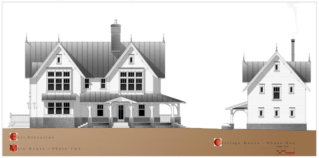
Here's a first for this blog. Digital drawings. Presentation drawings, actually. I have many new hand drawings that I will be posting soon but I wanted to stop for a minute and post some rendered presentation drawings that I have recently done in my newly acquired AutoCAD LT2016 software. AutoCAD LT is perfect for the projects that I typically work which are, as a rule, fairly small (i.e.; houses, carriage house, etc.) and since I can draw and visualize fairly well by hand, I don't really need the 3D component that is part and parcel of full blown Revit / AutoCAD. Besides, the reason I think Revit sucks is if you are using it in the preliminary design phase of a project, it forces you to make quantifiable decisions early in the design stage that you're just not ready to make yet. 


All that being said, there are quite a few techniques to use  in creating drawings like this in AutoCAD LT2016. There is no software program that automatically creates the shadows and rendered elements here. What you need to bring to the table is your own graphic vocabulary that was developed based on your understanding of how to draw and present by hand. In other words, things like line weights, gradient shading, foreground and background elements and so forth are things that you will need to figure out for yourself. As if you were drawing by hand. Stop thinking of AutoCAD as BIM and start thinking of it as a set of pens. That is not inconsisent with anything you have learned about layer management. Think of pens as layers (BIM) and pens as pens (drawing representation). They don't have to be mutually exclusive. Take shadowing an elevations as an example. Shadows are simply developed by using the classic plan projection method by hand, you're just using a computer. Use a simple line work hatch pattern (ANSI31) when you you are rendering / applying your shadow hatch. Set the rotation angle to match the angle you are casting your shadows at. Solid and gradient hatches don't stack well on top of each other in lines merge or overwrite mode. So DRAW ORDER and HATCH EDIT  (foreground/background) are going to be very commonly used  commands in managing or manipulating your hatch applications. Gradient hatch patterns (colors 250-255) were used for all of the gradient and solid grey tone rendering shown on these drawings. Gradient tones can be tricky, especially over large areas of the drawing because for gradient tones to work in hatch they almost always need to go on as a single application.


These drawings use a fine presentation level pen & ink vocabulary and compositional drawing techniques that I have developed by hand over many years. And since AutoCAD really hates excessive hatching, you kind of have to trick it sometimes by using a simple hatch pattern and then using hatch edit to change to your gradient pattern. Much less memory intensive that way.


Saturday, March 5, 2016

From Hand Drawing to AutoCAD....


This post is one of a few I am trying to do right now that start to combine drawings produced by hand in the early design phases of a project with their final iterations as AutoCAD design and working drawings and, hopefully, show that they share a common and mutually supportive vocabulary. Perhaps I should start by saying that, blog title notwithstanding, I do almost no working drawings by hand. That would be insane. If you have to share files or submit digitally (and you always do), your using AutoCAD as a bare minimum. Which is what I work with in the digital drawings you will see here. But as I've hinted at less directly in previous posts is that how you work in hand at the beginning becomes the template for the graphic vocabulary you use your in AutoCAD.  There are so many decorative elements like alphabets, entourage and shading, that allow a level of indulgence 
The Project...
This is a set of drawings for a proposed residential project in Denver, Colorado. The program is a complete remodeling and full second floor addition to an existing single story duplex residence in the largely historic Bannock Street neighborhood. The duplex arrangement will remain but be expressed as two urban townhouses with a brick common wall and shared common exterior stair to a roof deck with exceptionally nice mountain views to the west that the main elevation . The first studies shown here explored a more contemporary expression in massing, fenestration and use of materials. The existing common brick building is being treated as a shell with reconfigured exterior openings and a new shared covered porch. Each unit i

Scheme One...
The first few design studies of the front elevation where we were definitely pursuing a less restrained, more contemporary and urban level of expression with all of the major second floor spaces treated as volume spaces capturing dramatic views of the Rocky Mountains to the West. Both of the early schemes have the feature of common rear yard stair access to individual roof decks. With tightly abutting neighbors to the north and south and, as we went along, an increasingly restrictive zoning plane that severely restricted our building height options at the side yard elevations, the flat roof schemes were abandoned fairly early on.  Here, the existing one story building is treated as a neutral base for with the fenestration and new porch organized around the new 2nd floor spaces. 


Scheme Two...
This scheme was the last scheme using flat roofs we looked at before transitioning to the gable roof scheme you will see below. The project is in a neighborhood where the American "Four Square" single family house is the predominant building type typically with either hipped or Arts & Crafts-era gabled roofs. The setback from the sidewalk to the face of the building is about 15 feet so you really don't have a front yard to work with, which I think this scheme responded well to. The building height is only about 28' to the uppermost parapet on the front elevation. The common entrance area kind of changed the project syllabus from a development and sale standpoint (creating condominiums), so the we decided to stay with the expression of side by side "autonomous" townhouses.
The Drawings at this Stage...
All the hand drawings shown in this post are shown literally "on the boards", capturing them as they were still taped down and being worked on. Most of them are developed as hard line pencil & ink drawings on white tracing paper and rendered on both sides of the media with the usually assortment of Prismacolor pencils and lighter ChartPak AD base marker washes.


Thursday, March 3, 2016

Playhouse Design Competition Drawings...

Okay, I've really been ignoring this blog. This is, unbelievably, my third post in two days. Today's post is about some drawings that I did last year for the "Life of an Architect" 2015 Playhouse Design Competition. While the doing the drawings by hand was never really in question, how the drawings were made here was affected by an evolving condition in the drawing process that kind of caught me by surprise.


Final Board submitted to Competition
Jury at 24" x 36". Composed and noted
in Adobe Photo Shop. See below for
enlarged images of each panel.

The more I stay with this blog the more I am constantly amazed at the ever accelerating death of hand drawing in architecture. It's not just the computers. I can draw well with a computer, lots of people do. If you're reading this blog, you probably do too. Nor is it about what seems to be an often overwhelming lack of interest. It is more about the unintended consequences that this early death is bringing to the supply chain for people who still draw, out of habit, inertia or sometimes because it just plain ol' works. By supply chain, I mean access to materials and supplies you need on hand to effectively draw well. It's becoming almost impossible to find what used to be just your run-of-the-mill, every day drafting supplies. Essential doesn't even begin to cover it. Even, oddly enough, things like pink electric eraser strips. Absolutely a must-have for anyone who draws in ink on tracing paper or vellum and you can't find them anywhere. Anywhere except Amazon or eBay, where a box of twelve can go for as much as 120 to 150 bucks, I kid you not. For something that, just a few years you could get for, like, four dollars. If had known in advance and seriously stocked up for it, you'd have gotten a better return  on investment than most meth or arms dealers. And that's just the eraser strips. It's the loss of good art and architectural supply stores like Pearl, Charrette, Utrecht and on and on. And good luck finding people will to try dry mounting yellow trace drawings to gator board (another must for drawings like these). Maybe the thing to do is read the obituaries and start going to estate sales of dead architects. Not as absurd as it sounds. A working erasing machine is impossible to find new anywhere but eBay or Amazon, and there only if your lucky if you want truly new.


Design Study Drawing for Playhouse - Pencil and Ink on
white tracing paper. Drawn at 1/2" scale to accurately
study material profiles and alternate design features. Also
used to study color and rendering techniques later on in
the design process.

The funny thing here about drawing supplies is that they are ridiculously less expensive than most digital rendering software, even if you buy the best stuff than you can find. I was asked recently to help write a syllabus for an introductory class in architectural drawing by hand. We had a couple of discussions about the course goals and studio methods and the supply chain issue came up as more than a bit of an obstacle. I put together a basic list of materials I felt a student would need to effectively pursue the course syllabus. Many were either no longer available or so expensive as to be laughably impractical. The final cost would have exceeded the cost of the class. End of class. But it seems to have reached critical mass with the utter dearth of eraser strips on the market. I can't overstate the importance of electrical erasers in being to able to render in ink on anything other than Mylar. And Mylar has become so rare that even my spell check doesn't know what that is. I've talked on this blog before about yellow and white tracing paper can be surprisingly durable as a final rendering media. You can even make some major mistakes in ink work and save a drawing from an early death on your sideboard or in your trash can. You need a light touch and the right pens (Micron being the best), but revisions are possible. Which is, of course, huge. And it's not your trying to render in ink on linen. But you should put that on your drawing bucket list.


Design Study Drawing for Playhouse - Pencil and Ink on
white tracing paper. Drawn at 1/2" scale to accurately 
study material profiles and major design features. Also
used to study color and rendering techniques later on in
the design process.
So what about these drawings right here? Well, I went through the entire design and rendering process here with about 3/16" of an inch left of my very last eraser strip. Which means minimal mistakes on the final drawing, if any at all beyond the pedantic things only I would notice. Usually with drawings like these I do a study / base drawing to ink over before going into the rendering stage. You develop as much as you need to to trace over. Any tracing paper is good for this stage but match your final media so you can study rendering issues (colors / entourage) and techniques (pencil / marker / pastel). These drawings are maybe my favorite part of both the design and rendering process.

The competition rules required  a mobile (no foundation) playhouse with a maximum size of 8'w. x 7'd.x 8'h. with child friendly materials. Mobility was the overriding design criteria. Beyond that, it was up to you. Issues of permanence, appropriateness of scale, understanding a child's perceptions of space and shelter and the opportunities for long term use by means of an elemental and widely accommodating architectural vocabulary these drawings were developed at 1/2" inch and 3/4" inch scale. The drawings above show what these early design process drawings look like. The competition rules set a limit of one 24" x 36"  board per entry, submitted as a .jpg or pdf file. So I chose a portrait orientation for for my board, broken down into 4 A4 (11" x 17") portrait oriented panels with the final drawings done at  3/4" scale and scanned individually. Because this is a project for young children, material profiles and user safety were an ongoing design concern. Studying the project graphically by hand at such a large scale made the representation of the material profiles an immediate part of the design vocabulary without a separate, "post-schematic"  level of study. I mean, this is a playhouse. Speaking of which, these drawings have a design statement image you can click on and read down below , so I don't need to tread water here but I will point out that the goal wasn't just to create an imaginative play environment at a variety of levels but to do something with a high degree of constructibility and ability to be modified and/or moved to a wide variety of site contexts. So communicating that the project is made almost entirely and simply of nominal lumber was one of the major drawing goals here. In fact, one trip to Home Depot should do it in terms of buying what you need to build this project. The range of design expression here can run the gamut from straightforward carpentry to a "large toy" to a piece of fine exterior mill work designed to "stay in place" for a very long time.


Playhouse Axonometric and Plan. The 'money' drawing, as it were.
So what about the erasers? Like I said, all the drawings had to be set up like the images above and then very carefully inked. Small mistakes were possible with my remaining little eraser nub and I drew the final images on white tracing paper (not my first choice) if the the last ditch use of white-out became necessary. It's also the reason the main drawing is composed of four smaller, separate panels. Noting your drawing in Photoshop or Illustrator also minimizes a lot of risks and lets you study different board compositions and fonts as the presentation is finalized. Don't listen to what the person running the large format scanner at Staples or Kinko's tells you. Scan your images at 300 dpi minimum. With more color and pencil washes on a drawing (especially on white tracing paper) 600 dpi makes a difference. You can always reduce the size of the board in Photoshop after you have done your final composition and noting at a higher resolution.


While much of the design drawing emphasis here focused on the playhouse's simple constructibility and safety, the most enjoyable part of drawings like these at the end is in developing a supportive level of entourage. I kind of rolled the dice with here with that, hoping that something a little more relaxed and fanciful would be more appealing than the animatronic, pixel-eyed computer children that seemed to dwell in 99% of the other presentations that I saw. Looks like I was wrong about that but I still like my dragon, teddy bears and house pets. A personal process that hopefully every good draftsperson has, manual or digital. Here, each elevation panel's entourage tells a slightly different story about different features of the playhouse that I want to highlight. For example, the night views use contrasting color to emphasize the internally illuminated "lantern- like" quality the playhouse will hopefully have. Other entourage figures do more than convey scale, they identify design feature that show this is a playhouse for "parallel" play, for children of a wide range of ages. When built outside of the constraints of the competition rules (something to explored later), this playhouse could have a life long beyond its own childhood as a permanent addition to a suburban garden garden or urban roof top.
Save me, save me...!


I'll let the remaining drawings tell their own story. Frankly, I ran out of time on the submittal deadline before the drawings were rendered with pencil washes to a level that I would have been happy with. Wondering also if I should enter again since apparently this time the competition is moving to www.houzz.com.  So this year I am going to let the eraser strip gods decide this one. Almost a year later, I still can't find pink or soft green eraser strips for my Koh-I-Nor. If I can find them, sure, I'll bite. If not, forget it. If they're some of the few hand  drawings entered, whatever. But they should remain fun to do.
Elevations of Playhouse drawn at 1/2" scale. 


Playhouse Cross-Section, Alternate Design Studies and Design Statement.
Hand drawn at 3/4" scale and noted in Photoshop.


Elevations of Playhouse drawn at 1/2" scale.
Oh, one more thing. If you like this playhouse and would like to see a materials list that you could give to a builder and what the fully dimensioned drawings look like, that can be arranged. The material list doesn't include an estimate but it can be used to get a very accurate take-off price at a Home Depot, Lowes, from your Grandpa or another similar resource, such as a carpenter or good millworker. Or you could download these and figure out how to proportionally print to scale. Good luck with that.